Magazine - Curate Art Magazine

Curate is a contemporary art magazine highlighting the cultural richness and creative contributions of historically marginalized communities through the lens of heritage months. Each issue is dedicated to a different ethnic or cultural group, celebrating their art, history, and lived experiences through interviews, features, essays, and visual showcases. With a strong focus on representation, storytelling, and identity, Curate seeks to amplify the voices of artists whose work embodies tradition and innovation. The magazine explores how art serves as a tool for reflection, resistance, healing, and community building.
-
This magazine is designed for culturally engaged readers, including BIPOC communities, art lovers, museum and gallery professionals, educators, students, and socially conscious creatives. The magazine appeals to readers interested in intersectionality, heritage, and visual storytelling, as well as those looking to expand their understanding of cultural identity through the arts. Its rotating focus on different heritage months encourages ongoing readership across diverse audiences, while fostering cross-cultural awareness and dialogue. The magazine is also a valuable resource for academic institutions, arts organizations, and curators looking to diversify their collections and narratives.
-
The process began in the InDesign course, where I designed a masthead and completed the original cover, table of contents, and the inside spreads. Once the masthead was created, I came up with the issues topic and landed on portraiture, specifically African American artists and photographers, highlighting the gaze of this specific group of creatives. I then chose the artist I wanted to present on the cover, Marquest Cathcart. After I chose a work of his that I found fit the cover, and began on the design for the rest. I carefully chose artists I liked and photographs that aligned with the overall aesthetic I wanted to convey. For this expansion project, I started by adding a mission statement page to the front of the magazine that I intended to be displayed at the beginning of each issue, unique to the issue’s heritage month. After doing so, I made more covers for different months as well as their corresponding spine design. After this, I created mockups of my original designs. Finally, I displayed the masthead with a short description of the magazine, including the typography that I used to make the masthead.
-
Design Problems: My main issues on this project were designing the spine. I wanted to make a complex design that created an image when the magazines were stacked in order. This became much more complicated than I originally thought, and the outcome was not up to par with what I wanted to present.
Design Solutions: To solve this problem, I went simpler. I decided to just have the cover image bleed into the spine and include only the name of the magazine and the month, and the year of the issue. Although this is much more minimal than I had hoped for, it looks professional, clean, and cohesive, which is what I wanted my magazine to demonstrate.
-
Adobe Photoshop, Illustrator, and InDesign.
Covers
Seven covers were created to represent different Heritage Months. The original design, developed for February, established the visual theme that guided the subsequent designs
Client
Curate Art Magazine
Year
November 2024
Inside Spreads
Inside spread designs created for the February issue, showcasing layout, typography, and visual style.
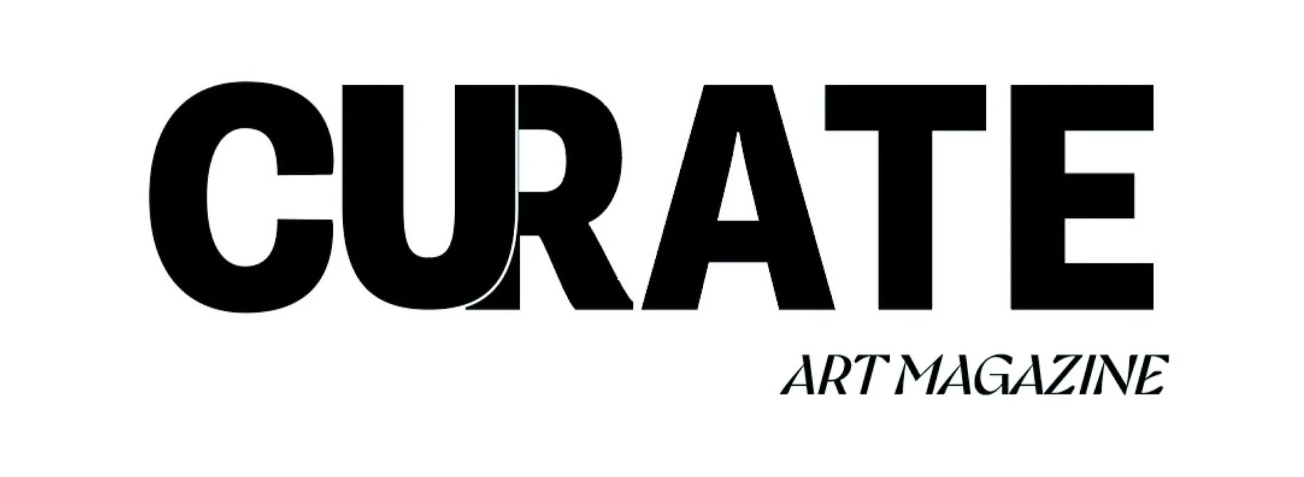
Masthead
The masthead for Curate magazine uses bold, clean typography to reflect the publication’s contemporary and editorial tone. The primary typeface, Supria Sans Condensed Heavy, gives the title a strong visual presence, while the secondary typeface, Gyst Variable Medium Italic, adds contrast and elegance.